If you want to achieve tilted background without using absolute positioning whilst content staying lined horizontally, CSS grid offers an easy solution.
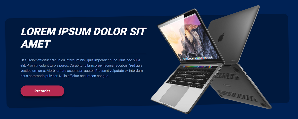
Inspiration was taken from Tailwind CSS homepage and it is used as a call to action section.
From the picture, you can see that we are trying to achieve a tilted background that is narrower in height in order to get the popping effect of the product on the right whilst having the description horizontally straight.
Step 1: Creating a CSS Grid & HTML structure
HTML
<div class="wrapper">
	<div class="box1">
    	<div class="background-box"></div>
	</div>
	<div class="box2"></div>
	<div class="box3"> </div>
</div>
We have a wrapper div which serves as a grid, 3 child elements with a first child only to serve as a background.
Box1 has a child element called background-box, once we add vertical padding to box1, the child element will add a visual effect of popping.
CSS
ΓÇâCreating the grid
.wrapper{
          display: grid;
          grid-template-columns: 0.1fr 1fr 1fr 0.1fr;
          justify-items: stretch;
          align-items: stretch;
          grid-gap: 10px;
}
Notice (in figure 2 below) that grid template columns are created in such a way that first and last fractions (fr) are set to 0.1; this way we achieve ΓÇ£paddingΓÇ¥.

TIP: you can visualise grid using inspect element, and clicking ΓÇ£gridΓÇ¥ button that appears on the side of element that was declared as grid (wrapper class div, in our case)
ΓÇâCreating child elements
.box1{
      grid-column: 1/5;
      grid-row: 1/4;
      padding: 50px 0px;
}
.background-box{
      background-color: #00193e;
      height: 100%;
      border-radius: 20px;
      transform: rotate(-1deg);
}
.box2{
      position: relative;
      align-self: center;
      grid-column: 2/2;
      grid-row: 1/4;
}
.box3{
      align-self: center;
      position: relative;
      grid-column: 3/3;
      grid-row: 1/4;
}
Box1 ( the background wrapper) will take up the entire width of the grid by setting the grid column to stretch from 1 to 5 (grid-column property), while height is declared by using grid-row from 1 to 4.
Box1 contains a child element ΓÇ£background-boxΓÇ¥ that will be styled to have a background color and a rotation.
Box2 & Box3 have grid-column coordinates to match 2 middle fractions that we declared in our grid, with full height using grid-row 1 to 4.
Notice that both box2 & box3 have ΓÇ£position: relativeΓÇ¥. This is necessary because adding the ΓÇ£transformΓÇ¥ property to the background-box element will result in pushing it to the front. By adding ΓÇ£position relativeΓÇ¥ we are bringing both box2 & box 3 back to front.
FINAL RESULT (THE CODE)